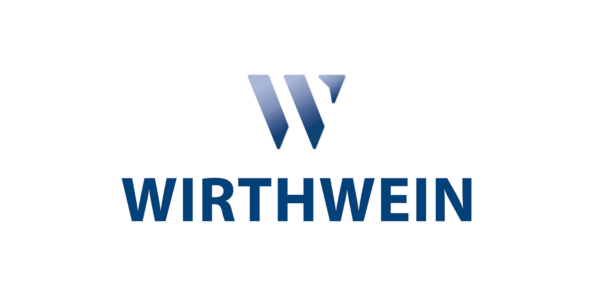
Since its founding, the family-owned company Wirthwein has relied on a simple wordmark—a logo consisting solely of letters, without any graphic embellishments. On the occasion of Wirthwein SE’s 75th anniversary, it was time to give the logo a more modern and striking appearance.
From word brand to word-figurative brand
In 2016, the logo was redesigned for the last time. The lettering was slightly modified and was given a more streamlined and modern look. The blue color was also made a bit lighter and more elegant. However, it remained a pure word brand. Now the logo has been revised again and the Wirthwein lettering has been supplemented by a signet in the form of an open “W”. This graphic symbol gives the logo its final touch. With the redesign Wirthwein aims to achieve a higher degree of recognition and better applicability. With the new word/figurative logo Wirthwein benefits from more flexible and creative use across all media and communication channels. In addition, the group of companies presents itself uniformly as 'Wirthwein' at all locations worldwide. In line with the slogan 'We are Wirthwein', all sites around the world will use the same logo in the future.
Proven and new
Wirthwein continues to rely on the color blue. The defined Wirthwein blue will be retained, as will the Wirthwein lettering. For the signet, the company has opted for a fresh color gradient from Wirthwein light blue to Wirthwein dark blue. Color gradients stand out, attract attention, are chic and create dynamism. At the same time, the dark blue of the lettering has a grounding effect on the logo and conveys stability. Blue stands for trust, reliability and professionalism. Tranquility and respectability are associated with this basic color.
Symbolism
What do people see in the new Wirthwein logo? An arrowhead pointing to the future and thus embodying innovation, movement and dynamics? Just the letter “W” or a “W” that stands for further development, growth and team spirit? Or do the addressees see three abstract elements that represent the three continents on which Wirthwein operates as a global company? Or maybe people see in the elements the three generations that have managed the company so far? The new logo stands for all of this - a symbol that combines what Wirthwein stands for. At the same time, it is a visual expression of the core business in the fields of plastics technology, toolmaking and interior design.
